
With Halloween settling down and children retreating back to their lairs so they can bathe in their sugary loot, it’s time to post an update, and not just any type of post – but a Spooky Scary Post-Halloween Monster Post!
Wallpapers
Before I get to show-and-tell I wanted to make a quick digression to something we noticed a few months ago after the 5.4 wallpaper was released…
There has always been some pretty harsh criticism against the wallpapers I’ve produced, some of this comes down to being bolder and more vibrant in our designs, and some of it some of it comes down to the fact that my early work was genuinely bad. We listen to comments wherever they come from (even if we don’t specifically reply), be it a forum on a news site, Reddit, or imageboards. Until Plasma 5.3 though the criticism lacked constructiveness and was mostly just mud-slinging. The Plasma 5.4 wallpaper though must have crossed a threshold at some point, because the entire VDG very specifically noticed an uptick in constructive criticism, and a it had a heavy influence on the 5.5 wallpaper.
What this all comes down to and what I really want to say is this; do be critical of our work! But be critical in a constructive way, so we can build on your comments. Calling a wallpaper “dogshit” doesn’t give us much to work with, but pointing out the Dutch Angle of the last wallpaper as being too extreme – that we can work with and improve the next wallpaper. Since we had the feedback, I’ll go over the two main points we’ve heard.
#1: The Brightness / Saturation.
More often worded as “the author must have eaten his crayons before puking on the screen” this was a result of how I initially imitated the 5.1 wallpaper with the Breeze palette, and absolutely failed; so much in fact that I think it may have affected the perceived colours of later wallpapers.
While some people certainly enjoyed the lighter wallpapers the main comment was that the over-saturated wallpapers were too much. Interestingly, wallpapers on Plasma 5 have been trending towards darker tones, below being some swatches I quickly composed of our wallpaper history:
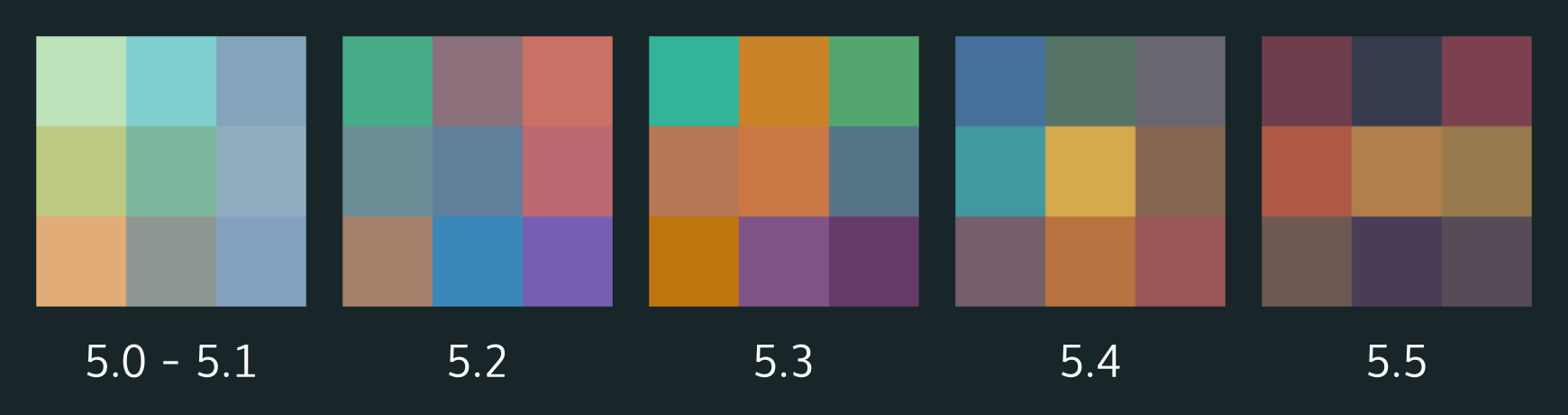 When I started making the wallpapers at 5.2 I had decided to stick with the official Breeze colour palette, which is geared towards icons. This meant that working at the same luminosity Nuno used for the 5.1 wallpaper would oversaturate mine, which is what happened. It’s worth noting that the 5.2 wallpaper was made purely for personal use, and it was only by a fluke that we used it in production. With 5.4 I think we approached the tipping-point of appropriate brightness/saturation, and I think we’re closer to the ‘right’ amount now considering out palette.
#2: The Dutch Angle / Drug Induced Wallpaper
This is a simple fix: stop using intense angles. But! If everything is made flat it becomes visually uninteresting. As a matter of fact none of the KDE wallpapers have been perfectly level, except Nunos original wallpaper which had clear vertical orientation. I think this was just because 5.4 was so extreme, and also because there were no other mounting points a user could visually register.
With the ‘acid trip’ feel of the last wallpaper, I think it was (again) the dutch angle throwing users off a bit along with the fisheye lens of the horizon line. I do worry that such a perception may impact the professionalism of the desktop, so for future wallpapers I may attempt to better avoid this moreso – though this wallpaper does maintain a more organic shape, which I expect may get dinged on that score.
So, what’s in the pipe for 5.5?
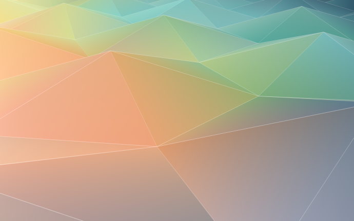
I’m very excited to announce we will be shipping 3 wallpapers this upcoming release. The two below continue the evolution seen in previous wallpapers. They are “Event Night” and “Event Day”. Event Night will be the 5.5 default.


Lionel Chauvins’ “Pastel Hills” will also be available, which harkens back to Nunos original design using a lighter pastel palette. I also have the feeling this is the first wallpaper we have distributed made with Blender. I highly recommend checking out his new KDE-look account if you like the smooth jazz that is his wallpaper, hopefully he uploads his other works. 😉
5.5 Wallpaper Contest
Finally, Andreas is continuing his wallpaper contest; the deadline is in roughly 9 days, so if you have a beautiful image you want to submit please jump in and submit your wallpaper!
KDE.org
KDE.org is undergoing a redesign which should one day present a more unified and consistent interface across the myriad of systems we currently use.
The most obvious issues with the current site are twofold; there’s no consistent navigation, and no two systems look alike. Because we have so many systems which are largely incompatible and/or on completely different hardware, we’re taking a unique approach to the new design so we can begin to unify the disparate designs.

We’re building the user-facing elements as a modular set of pieces which can be arbitrarily inserted onto any website, regardless of the technology or hardware they use, as long as they support even the most primitive skinning. These modular pieces are self-contained, and should be fairly easy to insert into existing systems until larger changes can be made.
I’ll have screenshots later (maybe a video) once I finish up a few more modules for feedback. Unfortunately I’ve had exceptionally busy weekends (when I get most of my work done) and haven’t been able to make the progress I had hoped for. I’ll post more on that later.
Fiber Browser
Because I have been swamped with smaller projects I’m temporarily going to put Fiber on hold to nail other things down, as I want to give more time to immediate smaller impacting projects across KDE as a whole, rather than constantly scrambling around several half-finished todos.
The original plan was to have a version which would be “presentable” at Sprints so I could garner interest, but that will be dropped. One thing that has become clear is that other developers will want to work on it regardless of me ‘promoting’ it, so I’m comfortable in the thought that I could assemble a small team later on. Also, the main KDE devs are busy enough anyway.
Next, after (very careful) consideration I may temporarily drop CEF and pick up WebEngine when I seriously resume the project. Fiber is a one-man band, and to say CEF integration has been nothing short of a pain would be an understatement. I feel like the most important aspect of Fiber will be a rich, deep API and modular design – but with so much focus on getting CEF functional it simply sucks the life out of the entire project. Instead, I may shift to a CEF port as a “Fiber 2.0” feature (hopefully when other devs may maintain the APIs), which should help as by then Servo will be more mature and I can test it as the primary renderer.
Unofficially I may still chip away at it – but for now I’m more comfortable saying it’s on pause while I focus on my todo list. I will resume work on it once I’ve bumped off a few smaller things, and hopefully It’ll speed up development a bit by switching to WebEngine for the 1.0 release along with having fewer balls to juggle.
Polish Effort
Before I say anything else, hats off to Hugo for his work. I’m not going to lie: I threw him to the wolves on this one (unintentionally!), and he’s solo’d the real work going into Breeze polish. So, hats off to Hugo for being blazingly awesome!
On the design notes, one thing that became apparent somewhat quickly was the fact that the design I presented began to heavily diverge from the current Breeze design, so much as to be considered a different design entirely. I’m still debating how to handle this, as this is one area where I wanted to free up time so I could more properly contribute.
In terms of stuff getting done, we’ll have some pleasing adjustments to several visual elements such as menus and pixel-tweaks. We’ve also identified several issues such as misalignments in applications, dark-theme colour woes, and inconsistent spacing; I don’t believe we have fixes in for everything, but I’m confident in my ability at throwing Hugo to the wolves. ;P
DWD
There’s not much to report here, but a couple people have been wondering about this. For those not in the know, DWD will be a protocol-driven solution for widgets in the titlebar, similar to the CSD approach that is the Gnome headerbar.
Mainly I’ve been working on the specification, and it’s been pointed out that DWD as a technology will never be suited for insanely weird and creative widgets. To mitigate this I had written some crazy crap about all the special and unique ways a widgets might be customised, and I realised it was pointless to try matching the “creative potential” of CSDs with endless options. I did a thought experiment and swung the other direction;
What if instead of offering primitive widgets with crazy tweaks DWD focused on higher-level but rigid purpose-driven widgets? You don’t request a slider with a volume icon, you request a volume widget and feed it a few channels. Instead of a lineedit you’d just put up a search box… And this approach shaped up surprisingly well.
The general mindset is the idea that CSD eschews system integration in exchange for more radical customisation. DWD on the other hand is about integration though standards – and the initial spec didn’t play to that strength. The main downside to this new spec is the fact that we do sacrifice more creativity in the headerbar, but I looked at it, and in most screenshots of Gnome CSD widgets seem remarkably standardised as well. I’ll be doing a post later which gets into details and pretty pictures but this seems to be the direction to move towards.
That’s all, folks!
Random Sluggerfly!

And where’s the source code for Fiber? I would be interested how did you solved / tried to solve CEF integration with QT …
LikeLike
I posted this over on /r/kde:
Couple of criticisms on the new day/night wallpapers:
* Not really a fan of the colour palette. It seems to be rather dark, with the exception of the bright orange which stands out (not sure if this was intended or not?)
* I think it would look a lot better without the sides being blurred
* Perhaps instead of having multiple colours directly transition to the background (the triangles being right next to the background), introduce an intermediary colour? (whether that’s a single coloured border, or a similar lighter coloured grouping of triangles)
I really like the Pastel Hills wallpaper and think it fits well with KDE Plasma 5 – simple, lightly coloured, and not many colours (or rather, the colours transition well to the others, no jagged/jarring transitions)
Nonetheless, good work 🙂
LikeLike
3D, you’re definitely not the only one. Imo the default wallpaper should be something elegant but unobtrusive. Nuno’s original wallpaper was absolutely sufficient in that regard, no need to spice it up further. Personally I’d change my wallpaper either way, but the first impression of these flashy abstract forms aren’t really convincing.
LikeLike
About the wallpapers:
Please, go back to simplicity and elegance. 5.4 was the first wallpaper which I changed because it somehow really hurt my perceptions.
The problem, somehow, is the same with the new one, although not that strong. My main problems are:
– What is the meaning (and purpose) of that artificial blur? Someone, who is interested in photography and is aware of the depth of field, knows that this kind of blur never ever occurs in real life. It’s just distracting and, in my opinion, ugly.
– What’s the meaning of those falling things? It looks like the whole structure is falling apart and some pieces are just ahead of their time.
– The background (the purple colour) is just too meaningless. After I noticed the curvature in the front I start looking for its „meaning”. But in the background I find nothing but emptiness.
Maybe I’m alone with my opinion and others consider this wallpaper really fantastic, but I just ask you not to publish this art in this form.
Thank you for reading.
LikeLike
Truth be told, I don’t like the new wallpapers. If I were to summarize:
The good:
1. Two wallpapers versions to chose from: Day and Night.
Since Breeze light and dark versions it should also have a wallpaper to fit each of them.
– Vibrant colors.
I’m not so sure if that purple is a right fit though.
The bad:
– The blur.
It’s just horrible. The wallpaper should be crisp, clean and in-sync with the rest of the breeze theme. It just give a feeling of lacking in quality. I understand that you wanted to focus the center of the wallpaper, but there are better ways to do this.
– The center of the wallpaper.
I just don’t understand why the center figure is so thin compared to the rest of the image? Is like a structure that is breaking apart? The small fragments should reflect this breakage? I just don’t understand it.
The last wallpaper is more conservative. The angles are nice, somewhat in theme with Breeze, but the colors are lacking a lot. It just gives a boring impression.
Hope that didn’t sounded to harsh and that the criticism was to some degree useful.
Thank you for reading!
LikeLike
On the blur, it doesn’t matter that it doesn’t happen in real life and I really don’t see why an abstract piece should be treated as if it were real. I did some quick polling around and I was told to keep the blurring, so it will stick for this release, and if I notice significant push-back then next release I’ll reel it in.
On the “structure” of the wallpaper, it wasn’t designed to be a crumbling or straining structure – it was designed to be more liquid in nature, not unlike a lava lamp or a fluid medium suspended in space.
On the background, there’s several reasons for the design. The studding was added specifically to orient users to horizontal/vertical planes, but otherwise it’s filling a whitespace role to avoid overcrowding the wallpaper – and white space is fine, not everything needs to be “stuffed with stuff”. I had an alternative where I used rows of triangles, but it was too busy, and it also made the wallpaper feel as if it were sitting on another flat canvas – and I’m not doing another 5.4 where I place two curved surfaces on each other.
Anyway, thank you guys for the feedback; I am compiling the feedback on this wallpaper so I can improve the next one.
LikeLike
Why not offer both? One with the blur (as default), and one without? 🙂
LikeLike
About DWD i have idea to add button on title bar, which hide DWD’s widgets and show it
https://forum.kde.org/viewtopic.php?f=83&t=126659
Look also libgreattao(download it and check sources of demonstrating programs).
LikeLike
Windows (vista/7/8/10) uses a similar method; an application may draw its contents over top the window, and additionally request that the frame provides additional glass for those contents. There are a couple other methods available on Windows, but that’s the “preferred” way of doing it. Assuming the application hasn’t been “naughty” in any ways, it also allows for the user to use the window buttons.
Otherwise, making the user intervene on account of a preventable issue isn’t really the correct choice, and DWD side-steps the issue entirely by putting the widgets on the server-side. When using DWD the client simply requests what it wants, and will accept signals from the server based on what the user has done with the servers buttons. The user doesn’t need a bailout button because – even if the app is totally frozen – everything on the window frame will just work, though the extra widgets may enter a disabled state until the app recovers or is closed.
Additionally, DWD doesn’t stop at the window frame, and applications may also see widgets integrated into other areas, such as the panel, or even potentially a phone. Because of this, the user would have a configuration option (perhaps not on a per-window basis as per your idea) on where/how they want their content displayed. Maybe the user will want application controls in a sliding panel. 😉
LikeLike
Thank you for great artwork! I really love The Dutch Angle. Is there any way to get this wallpaper in a higher resolution? I am running KDE on Lenovo Yoga 2 Pro notebook with 3200 x 1800 resolution, so current wallpaper resolutions provided by KDE is not enough 🙂
Can you make higher res version available? png or svg (for those wishing to play around) would be ideal 🙂
LikeLike
Yep, we do have much higher resolutions available – the wallpapers are vector, so we can offer them in pretty ludicrous sizes.
It seems like our share is having a hiccup right now, so this link may 500 error you, but if it doesn’t let you download the wallpaper in a day or so let me know and I’ll find another place to put them. Below are links to the 3200x1800px versions. 🙂
Night:
https://share.kde.org/index.php/s/vJJmK5eaG04IFlp
Day:
https://share.kde.org/index.php/s/54499XNgx20Pow1
Pastel Hills:
https://share.kde.org/index.php/s/ZXxlx4bMZrmgaNM
LikeLike
Still getting Internal Server Error 😦
LikeLike
I really like were the wallpaper thing is going! Nevertheless the first thing I do on a fresh Plasma instance is changing the wallpaper, usally to a calm landscape/seaside pic from the elementaryOS set. But thats just personal preference.
LikeLike
Hopefully we’ll also have some nice photography wallpapers in our extended wallpaper package as well. I definitely agree that Elementary has some nice wallpapers too. 😉
LikeLike